
Low-Income Households Face Higher Inflation Rates than the Wealthy
Weekly Lab Report - March 26, 2026

Recent inflation reports show a slowing in the rate of price growth. The Bureau of Labor Statistics (BLS) reported on March 11, 2026 that the all-urban Consumer Price Index rose at an annual rate of 2.4 percent in February, down from its 2.7 percent rate in December of 2025 and considerably lower than its 9.0 percent rate in June of 2022.
Does that mean, however, that everyone across the income distribution is “enjoying” a 2.4 percent inflation rate? By no means. Households at different parts of the income distribution face different inflation rates, which is an important feature of the inflation landscape for analysts and politicians to keep in mind. Table 1 compares overall inflation with inflation by income quintile.
About 60 percent of the population faced an inflation rate in February that was likely higher than 2.4 percent. Research conducted by BLS in 2024 indicates that the bottom three-fifths of the income distribution experienced an inflation rate higher than the “typical consumer unit,” and the top two-fifths had an inflation rate lower than the official rate. In other words, analysts should not rely on the announced CPI when drawing conclusions about affordability across the income distribution.[1]
Table 1. Inflation Rate Varies Across Income
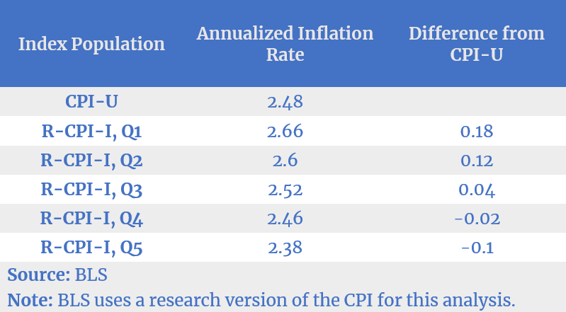
Source: BLS
Note: BLS uses a research version of the CPI for this analysis.
Why would these differences exist? The reason stems from how much of certain goods with high price volatility a household consumes. For example, high-income households spend a larger percentage of their income on optional, nonessential items and less on food, transportation, clothing, and housing. Low-income households spend a higher percentage of their income on these necessities and less on nonessentials. If the housing component in the CPI rises by 5 percent, this increase will affect lower-income consumers more than higher-income ones.
For example, the Proctors (an imaginary household) are a low-income family in the bottom 10 percent of the income distribution. Nearly 80 percent of their earnings goes to pay for housing, food, transportation, and clothing. The Lowry family (another imaginary household), on the other hand, is in the top 10 percent of all income earners. They only spend 30 percent of their income on these necessary items. Thus, a price rise in these essentials will affect the Proctor family more than the Lowrys. This disparity is especially evident if prices for the rest of the CPI basket of goods are relatively stable.
The lesson here is evident: When using average price increases to talk about the state of inflation, analysts need to be cautious about the composition of consumption across income groups. Politicians especially need to be cautious, since voters are present in every income group and may be feeling very differently about the state of economic activity.
[1] Note that Q1 is the lowest income quintile and Q5 is the highest. This graphic originally appeared in William W. Beach, “Flat Job Gains: The EPIC Jobs Report for March 2026,” Economic Policy Innovation Center, March 6, 2026.